Solera Health
In simple terms, Solera Health works with health insurance companies to get their members enrolled in weight loss programs. My job was to lead the effort in creating web apps that connected members to health coaches and self-serve applications.
Solera sees a large gap in the healthcare ecosystem. Nearly one-third of Americans are at risk for developing type 2 diabetes. Health insurance providers and employers are seeking low-cost disease prevention programs for their members and employees. So Solera works to build a bridge between the health plans, members, employers, and providers through an automated system. The Solera platform does outreach to encourage members and employees to join a weight loss program while managing the network of providers and billing based on milestones.
Challenges:
- Being the first UX designer, I had to create and evangelize a design process.
- Adapt some of the designs that were already in place.
- Research and understand a unique business model.
- Create personas of interested participants of diabetes prevention programs
- Iterate enrollment website based on constant change, new initiatives, and accessibility requirements.
Their old web site
Step 1: The landing page
Step 2: Health assessment questions
Step 2: Health assessment questions

The health plan membero clicks on "Take the 1-minute quiz" to take the risk assessment. This enrollment website was focused on assessing your risk for type 2 diabetes and enrolling members into diabetes prevention programs that focus of weight loss.
Step 2: Health assessment questions
Step 2: Health assessment questions
Step 2: Health assessment questions

These questions were the bare minimum to determine if someone is a risk of developing type 2 diabetes.
Step 3: Assessment results
Step 2: Health assessment questions
Step 4: Select your health plan

The member then gets their result. If the answers to the assessment questions suggest that they are at a high risk, then a weight loss program is recommended. If their answers suggest that they are not at risk, then they are given a "Good news" message.
After observing user activity in Mouseflow and Google analytics, and conducting moderated usability tests, we realized that the results page created more questions than answers. It made the members contemplative about their health and led them away to do more research on their own instead of continuing to the next page.
Step 4: Select your health plan
Step 4: Select your health plan
Step 4: Select your health plan

This page was one of the biggest hurdles. The page had the largest amount of drop-offs for various reasons. Some members did not know the exact name of their health plan because some health plan names are similar to others. Some members didn't have their health plan member ID readily available. Most members wanted more information about the weight loss programs before entering their information.
Step 5: Matching questions
Step 4: Select your health plan
Step 5: Matching questions

After the member selected their health plan they were asked a series of questions that would match them to a program that fits their learning style.
Step 6: Best match summary
Step 4: Select your health plan
Step 5: Matching questions

The member would see their best match, the program that fits their learning style preferences.
Step 7: Health plan form
Step 7: Health plan form
Step 7: Health plan form

The last step before enrollment confirmation was for the member to complete the health plan form. This was bar far the biggest drop-off point in the user journey.

In my research-based approach, I got the chance to:
- Conduct interviews, and surveys, and observe potential participants in the appropriate demographic.
- Gather all the insights in order to design personas.
- Create low fidelity and high fidelity prototypes for requirements validation and user-testing.
- Iterate the prototypes based on insights from user-testing.
- Support the product managers and developers in the production of the website.
- Test the coded website to approve the designs before deployment.
I discovered personas

Quick summary
"A persona is a fictional, yet realistic, description of a typical or target user of the product. A persona is an archetype instead of an actual living human, but personas should be described as if they were real people."
- Nielsen Norman Group
With the help of the product team, I designed three personas that were based on potential customers who were engaged by marketing and showed some form of interest. They were created to help us design interactions for users of the website. This is just a high-level description of each. If you're interested in the details, contact me.

Flexible Frank
Excited to learn and create new habits. Thinks there are too many cookie-cutter services out there. Personalization is more attractive.

Janet the Juggler
Barely has time for self. Needs flexibility and convincing that there is enough time to do something new.

Iris the Investigator
Wants guidance, specifics, and clarity. Ways pros and cons, and looks for reasons to trust in decisions.

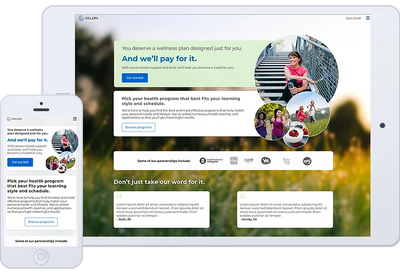
New website
Step 1: Landing page
Step 2: Health assessment
Step 2: Health assessment

After months of qualitative and quantitative research, I redesigned the landing page. Since we had added more types of weight loss programs for various health plan providers I created a landing page that was configurable with content that was generic enough to apply to most member demographics.
Step 2: Health assessment
Step 2: Health assessment
Step 2: Health assessment

Instead of showing a list of questions on the page, I proposed that we asked one question at a time so that the user can focus. This also made the questionnaire engine more flexible and scalable depending on business needs. This design also provided more content real estate if questions needed more clarification or complementary visuals.
Step 3: Choose a program
Step 2: Health assessment
Step 4: Verify information

The old site showed a results page that showed a risk gauge illustrating the member's health risk level. It made the members contemplative and led them away to do more research on their own health instead of going to the next step and choose a program. This page design is intended to let them learn more about the program while seeing their choices - if they indeed qualify for a weightloss program.
Step 4: Verify information
Step 5: Health plan information
Step 4: Verify information

Once the member showed interest by selecting a program, we collected and save their contact information just incase they don't complete the enrollment.
Step 5: Health plan information
Step 5: Health plan information
Step 5: Health plan information

Having this form at the end proved to increase conversion because the member at this point is most informed and hopefully inspired to finish this last step. Collecting this information was mandatory so that the health plan can make sure this weightloss program is covered.
Step 6: The hand-off
Step 5: Health plan information
Step 5: Health plan information

We hand the member off to the program's website or mobile app to meet their coaches and/or cohorts. This page also reminds them of a few incentives to meet their milestones. Incentives included digital scales and fitness trackers.